Pull up any world map and look at Greenland. It looks enormous — roughly the same size as Africa. Now consider this: Africa is 14 times larger. Not a little bigger. Fourteen times. The standard Mercator projection, designed in 1569 to help sailors navigate, stretches landmasses near the poles and shrinks those near the equator. We kept using it for everything — classrooms, news graphics, Google Maps — and it quietly warped our sense of how big places actually are.
The Real Size of Africa
This is the example that breaks most people's brains. You could fit the United States, China, India, Japan, and most of Europe inside Africa and still have room left over. On a Mercator map it looks comparable to Greenland. In reality it's 1.8 times Russia and about 14 times Greenland.
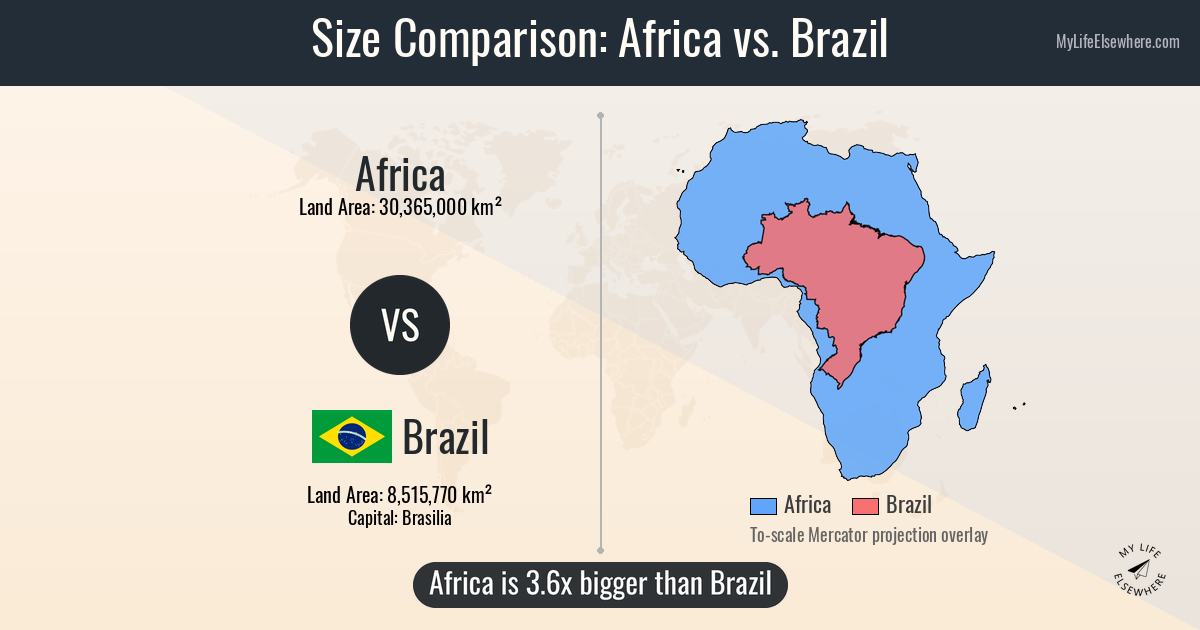
Africa overlaid on Brazil at the same scale. See the full comparison →
How Bad Is the Distortion?
The further from the equator, the more Mercator inflates a country's apparent size. Countries near the equator get the opposite treatment.
| Territory | Actual Area (km²) | Mercator Distortion | Compare |
|---|---|---|---|
| Greenland | 2,166,086 | ~16x inflated | vs DR Congo → |
| Russia | 17,098,242 | ~2x inflated | vs Brazil → |
| Canada | 9,984,670 | ~1.6x inflated | vs Australia → |
| AFAfrica (continent) | 30,370,000 | Shrunk ~0.6x | vs N. America → |
| India | 3,287,263 | Shrunk ~0.7x | vs Greenland → |
A few more that catch people off guard: India is 50% larger than Greenland (1.4 billion people vs 56,000). Brazil is almost exactly the size of the contiguous US. Australia is wider than the distance from London to Moscow. Here's what Greenland actually looks like next to India:
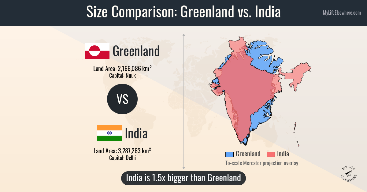
Greenland overlaid on India. India is 50% larger. See the full comparison →
See the Actual Sizes
Our interactive map lets you drag any country, state, or continent onto a globe, overlay it on another region, rotate it, and compare at real scale with projection distortion removed. Add as many as you want — geography teachers use it in classrooms, and it's surprisingly hard to stop once you start.
Want it on your phone? The MapSize app has the same drag-and-drop interface — free on both platforms.